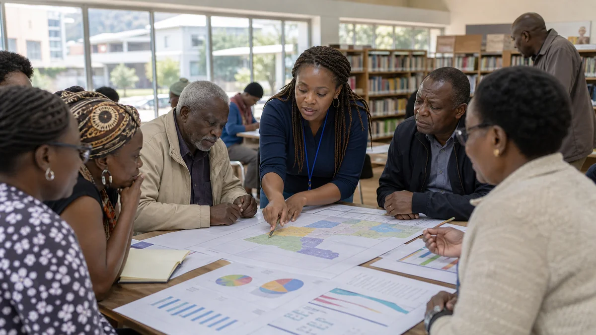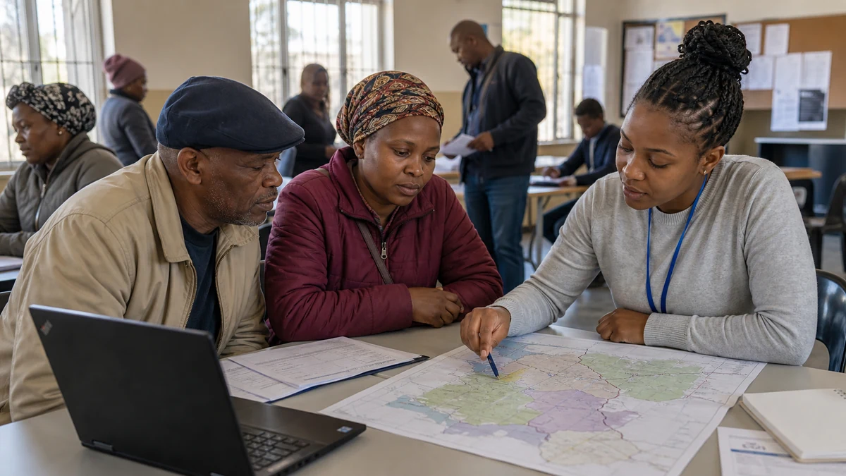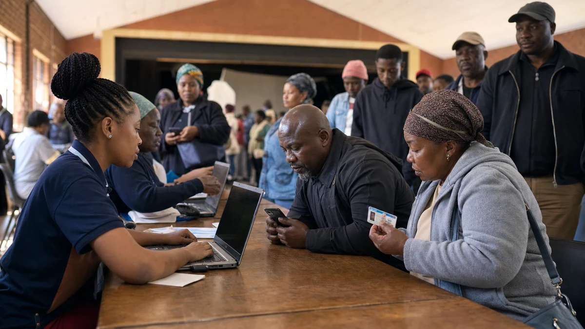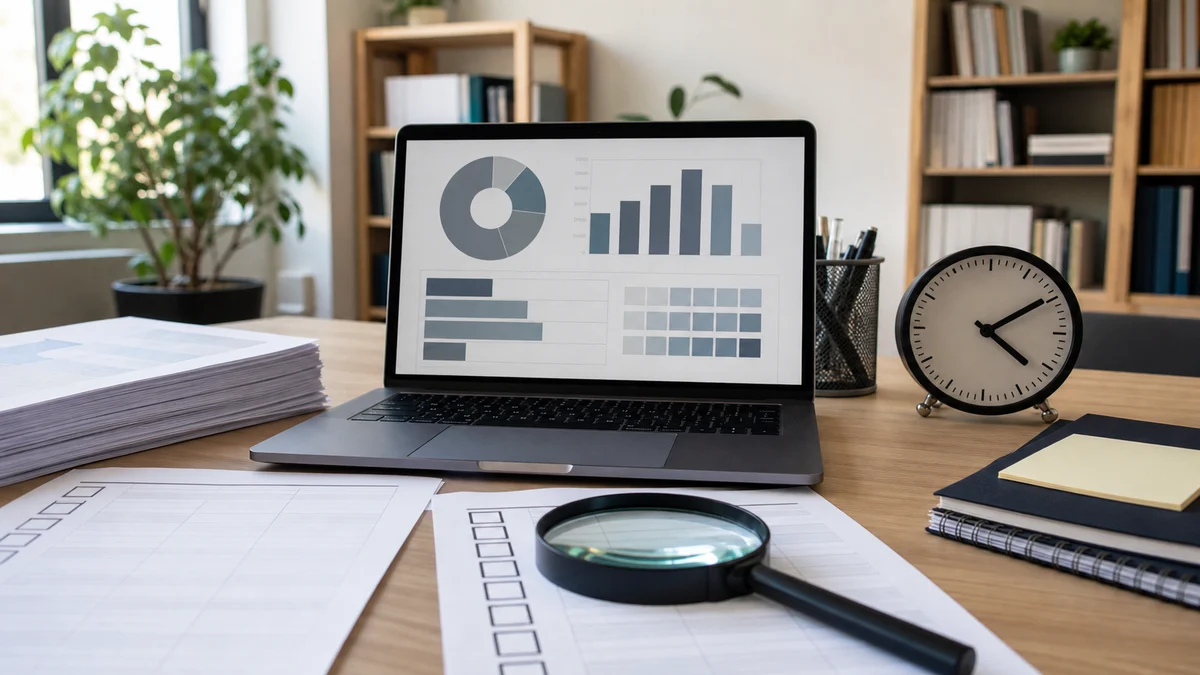
An election dashboard can help democracy, but it can also create confusion when numbers arrive without explanation. Turnout, polling-station results, constituency maps and vote totals can look official on a screen. Yet citizens need to know where the data came from, when it changed and whether any correction has happened.
Trust starts with source clarity. A dashboard should name the election body, observer group, newsroom or civic group behind the numbers. It should also show whether figures are official, provisional, partial or estimated. A reader who cannot see that status may treat an early count like a final result, and that can damage public confidence.
Update time is another important detail. A result page that says 58 percent counted without a time stamp is risky. The figure may be old, or it may refer to polling stations rather than ballots. The dashboard should tell readers what the percentage means. Plain labels prevent political actors from using the number in a misleading way.
Correction notes matter too. Election nights are fast, and mistakes can happen. A good dashboard should not hide every correction. It should explain what changed, why it changed and when it was fixed. That kind of honesty can build more trust than pretending the page was perfect from the start.
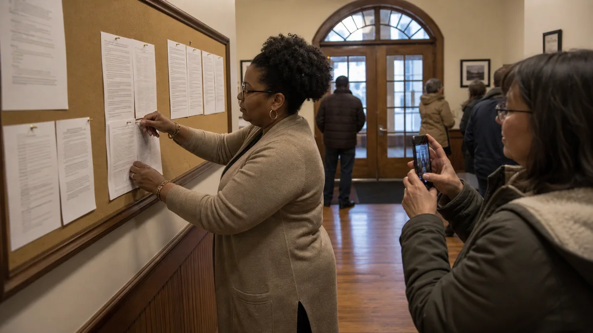
Voters also have a role. Before sharing a screenshot, they should check the timestamp, source and link. A cropped image with no date can travel for years. A live table can become false when it is separated from its context. Civic discipline means sharing numbers with the information that makes them understandable.
The checklist below gives readers a quick way to judge a dashboard. It is useful for voters, community leaders, journalists and party supporters. Election information should move quickly, but it should also move with labels. A democracy is stronger when citizens can see not only the number, but the path that produced the number.